Monday, May 17, 2010

Jean Michel Basquiat

NOTES :)
-a lot of his work was about scars, the body, rearranging the body.
- Started working on art around 18
- Ran away from home at 18, lived on friends couches, streets of Manhattan
- lived a life separate from the art world.
- Started as a street artist- constantly overlapping
- inspired by his childhood
- uses words in art, marking out
- Jazz as an inspiration, constantly painting while listening to jazz
- used multiple different things in his work

Untitled (Skull)
-street map
- quilt
- fr
ankenstein
- cave paintings
- interest in anatomy
- ugly/brutal in art
- questions beauty and relationship to art
- rooms
inside the brain
- responds to rules of art making
-layers


Untitled
- distortion of the male form (?)
- expression of angry person


- Interest in the history of art


Other images
(quality meats for the Public, 1982, Trumpet 1984)
- interest in crowns,
- jazz music
- signs

Tuesday, May 11, 2010

Abstract Expressionism

Abstract expressionists, such as Jackson Pollock, Kooning, Kline, and Rothko sought to merely express ideas and feelings within their work rather than express objects which had been the name of the art game for centuries. Of the artists we looked at this week my two favorites have been Jackson Pollock and Marc Rothko. Of all the abstract expressionist artists I have looked at, these two seem to be the best at expressing complicated feelings and emotions purely with colors and lines.
Pollock's way of working is unlike any artist I have seen. The seemingly unrestrained, unrefined toss of the brush creating very deliberate meaning. My favorite of his artwork is titled Number 5, 1948. This piece is a clear example of Pollocks use of layer after layer of varying colors to create a feeling.
While Pollock us
es varying layers of colored lines to create meaning, Marc Rothko uses deep solid blocks of color and the spaces in between to express his emotions. My favorite piece of Rothko's work was a small piece of work completed by Rothko after a period of sickness. It is an untitled piece of art, created in 1969.
Both artists were integral parts of the abstract expressionist movement, and have been revered as giving off high emotional reactions to their work. One day I hope to see one of these works in person so that I may truly appreciate the power of the color and texture

Postmodern Shoes

The ideas Jameson explores, postmodernism and the idea of pastiche are important to understanding the movement and artwork of the time. The symptoms expressed within the post-modern movement include a weakening of historicity, breakdown of the distinction of high and low culture, depthlessness, intensities and the new technologies. All of these aspects or symptoms are expressed through the schizophrenic position of the time, especially the loss of historicity. Another important aspect of Jameson's thoughts on postmodernism is the "cultural logic of late capitalism. Pastiche is the neutral imitation of a peculiar or unique style. Jameson also calls this sort of style blank parody because it comes without the ulterior motives of parody. Jameson credits our lost connection to history to pastiche. We no longer see the real past, but rather a nostalgic look at a time in which we view stylistically. Jameson says we can see this within postmodern architecture, historical novels and nostalgia films.

Power of Art: Rothko

"Just how powerful is art?" The narrator questions in the first 5 seconds of the video. "Can it feel like love and grief? Can it change your life? Can it change the world?" Though these questions are very broad and common and gives the opening of this documentary of Rothko a somewhat cheesy start, it is a good, honest question while looking at Rothko. The work of Marc Rothko is very powerful, it does not express a certain situation, per-say, but it does express certain feelings. If any work can feel like love or grief, it is the work of Marc Rothko.

The first segment of the video starts with the arrival Rothko's work at the Tate gallery and the connection to his suicide that same day. This is a very powerful way to start a documentary, especially one about an artist who could convey so much of his own pain through his work. We are then introduced to the society and art world of the 1970s when our narrator was accidentally exposed to the works of Rothko and deeply affected. This allows us to understand a personal account of what it would feel like to see Rothko for the first time in his own era. Next we are given an example of what it might have felt like to experience these works and what sort of thought ran through the narrators head.

The second segment started in on the biography of Rothko. In a weird cooking channel explanation of Rothko's childhood. We are introduced to a kid who was always ready to please his mother, work hard and share his knowledge (even when no one wanted him to.) The narrator explains his life through the lens of Judaism and it seems to me, the viewer, that this was either a constant struggle of Rothko's life, or that the writer was anti-Semitic. We then skip back to the recount of the Seagram job. Then back to the 1920's when he dabbled in expressionism. They mention that his work at that point of his life were not good because he was thinking too hard, an interesting point when dealing with art, which walks the thin line between thought and expression.

The third part of the series starts with the subway series. Rothko's colors begin to be questioned, as if the start to his later success. We are told that Rothko called his colors performers. This idea is very interesting, and very true to the visual arts. I think that it can be said that the artist is like a conductor or director, and the colors are the performers. The actor portraying Rothko is somewhat creepy, delivering the real thoughts of a human person in the way you might read Shakespeare aloud in middle school. His Jewish accent seems to come and go with each short quote. The black and white add to the creepiness, as does the swell of the violins in the background. I think it is very interesting that Rothko wanted to bring in the sense of tragedy that his work portrayed to the 4 seasons. I also think it is interesting that the 4 seasons wanted his work which is by the narrator's words funereal. If I had to guess I would say that the hotel had not really taken much but his popularity into account when commissioning him for this job. I liked the idea of his connection to Matisse's "Red Studio" as the thought of "liberating color." I think this might be a good connection, if Rothko had been able to take these ideas away and use them as soon as he was exposed to them.

Part 4 starts with Rothko going on vacation with his family once the Seagram job was finished. The narrator goes into a reported conversation that Rothko had with a fellow passenger on the cruise ship he was aboard, claiming that Rothko hoped that his paintings ruined the appetites of those who went to the Seagrams restaurant. I liked this idea, as it expressed what I had thought about his work in the restaurant. In this section Rothko begins to sell his work. There is a discussion about the difference and battle between prettiness and power. I think this is a very important question in the art world, not just about Rothko. There are many works of art I may consider pretty, but do not particularly move me, and the same is true the other way around as well. I think an artist needs to find which side of art they want to appeal to, the pretty or the powerful, and work until they can appeal to both. This segment also gives a very moving description of looking at a Rothko piece, and it makes me want to visit these works in person. I would like to explore the ragged spaces in between the blocks of color, as those seem like the most important spaces within the painting.

Side note: A random angry comment on the video reminded me of a stand up comedian named Pete Holmes who talks about youtube comments and their negativity. He's a funny guy, Check Him out Here

Part 5 starts with an introduction to the period of time when Rothko was equal to Pollock and other great artists of the time. I like the idea that he did not like to be complemented on the beauty of his artwork, and that he did not want his work to be soothing. Now we are finally introduced to the reasons behind Rothko agreeing to do the 4 seasons restaurant job.

Part 6 starts with Rothko realizing that the 30 paintings he had done for the 4 seasons were not going to hang in the 4 seasons. He wanted to create a special space, "his space" which I think is the dream of most artists.

The last part of the series starts with the introduction to the cathedral commission in Houston. These large black canvases seem to convey the pain that Rothko was feeling. The quote "It seems he was painting to see how dark he could make the light" seems very appropriate, as well as a literal translation of what he had been metaphorically doing his entire career. His earlier works were very colorful, but still were trying to access the deepest feelings within a person, to find the darkness within someone and bring it out through their viewing of a painting, these works of the chapel seem to be more literally connected to darkness. The end of the documentary is somewhat sappy, but very moving, as we learned a lot about Rothko, his work, and his influence.


Dimestore Alchemy

Of all the readings we have done for this class, this has been by far my favorite. The beautiful poetry in relationship to Cornell's beautiful boxes is truly wonderful.
My favorite of the poems from the book was titled "Soap Bubble Set" and was based on Cornell's "Soap Bubble Set" box. The box itself is beautiful, the baby blue and the worn-paper yellow. The carefully placed egg and baby doll head. The map of the moon, and the beautiful shining soap bubble pipe. All of this is brought together so beautifully and peacefully.
In my high school art class we studied Cornell, and his boxes, and even created Cornell-esque boxes. I thought it was a very fun exercise. I think one of the great joys in life is finding beautiful objects in places you wouldn't expect. That is why I feel I have a connection to Cornell, and through him, a connection to Simic.
Simic's poetry is fragmented, heartfelt and beautiful, my favorites of his poems are typically the short wonderful pieces based on Cornell's work. "Untitled; Soap Bubble Set" is one of these pieces. Through his poetry Cornell's seemingly unrelated objects are given context and deep meaning. Within this particular poem the metaphor of a soap bubble is given in relationship to the other objects within the box. "The heavenly bodies are soap bubbles." Simic writes, "They float into the empyrean, cradling the dreamer." Simic goes on to give us the beautiful phrase "The leap of the ballet dancer is a soap bubble, too." The poem rounds out, as many of Simic's poems do, with a deep, somewhat unrelated thought, in this case "The world is beautiful, but not sayable. That's why we need art." This line affects me deeply, as if vibrating on the same wave link as my own thoughts and beliefs. Simic is right, the world is beautiful, but not sayable, not fully expressible, which is why Cornell's work such as "Untitled; Soap Bubble Set" is so wonderful. It expresses the random, seemingly unconnected, and beautiful things that life gives us as readily and unexpectedly as Cornell finds these objects.

April 23- Picasso and Braque, Brothers in Cubism

Though Picasso and Braque were indeed brothers in Cubism, their relationship seems to me to be a very important aspect of their artistic lives and style. Pablo Picasso is no doubt the more famous of the two cubist artists, but when a large exhibit features the work of Braque, a very similar yet less noted artist, with just as much emphasis and care as they do Picasso's it makes you double think the reasoning behind the fame. This article makes you think about when Cubism was being created in their shared studio, and who put more into the process or who created the first truly cubist work. It also makes you wonder how much a name affects the popularity of a work, and whether or not Braque would be more famous if he had been as open as Picasso. Although I did not really connect to the 1989 article, I sought out to find on my own the works of Picasso and Braque and compare the two. I also wanted to explore their relationship on a deeper level than explored in the article. I am no expert but I felt like no one can really know how much one person affects another and vice-versa. While exploring the vast world of the internet in search of comparisons between Braque and Picasso I found a couple of different things.
The first thing I found was this nice little game.
A tic-tac-toe game in which Braque and Picasso compete for the win with their artwork. The creators of this page seem to believe that the relationship between the two artists was more of a competition than a friendship, and mention the fact that both artists signed their work on the back as to compete in a purely artistic level. I thought this was an interesting tool in exploring and after tying 10 games, winning 4 and losing 2 I decided to move on.


The next thing I found was another article in the New York Times. This article, from April 2007, was about the two artist's shared fascination with the movies. I thought this was an interesting idea to explore in both the relationship of the two men, and the affect this fascination had on their work. Within this article I learned about the direct relationship to cinematography and certain visual choices of George Melies in relation to the work of Picasso. Also within the article was another side of cubism and the artists' relationship, a competition to movies. I also found a Charlie Rose episode devoted to the exhibit mentioned within the article, "Picasso Braque and early film in Cubism."

The most helpful source I found in trying to discover more about the friendship between Braque and Picasso was a slideshow on Powershow.com. This slideshow featured many artists in relationship to Picasso, but once you reached the middle you saw the clear relationship of Picasso and Braque. The slideshow is called "Creative Friendship and the Making of Modern Art." The slideshow placed many of the artists' work next to one another and made commentary on the relationship of the men, and the relationship of their artwork.


Though the New York Time's article, "Picasso and Braque, Brothers in Cubism," did not particularly connect to me, it moved me to explore the relationship of the two artists on a level I would not have understood prior to reading the article. Also, it has urged me to take a second look at cubist works in general, which I am not particularly fond of.

Monday, May 3, 2010

Work of Jackson Pollock (unrefined)

artist would make work, critic responds to it, effects public opinion, but also the artist.
-they change something to fight the critic or they embrace them

Ways of Seeing Pollock's work.

Two main critics in New York
- greenberg- formalist critic (studies form, line color etc.) describes Pollock as "all over artist"
- rosenberg- canvas is stage. act of painting.
French Perception
-french artists fled to united state (new york stole the art world)
-think about these paintings as expression of unthinkable horror (world war 2)
-cant make painting with meaning, meaning is too terrible
Effect of Photography
- what to do as painters as representation is being taken over by photography
- ed rinheart- smooth black painting
Like Landscapes
-like a thicket, you could walk into painting and be stuck forever in same landscape

Notes on Action painting (unrefined)

"If a painting is an action the sketch is one action, the painting that follows it another. The second cannot be "better" or more complete than the first. There is just as much in what one lacks as in what the other has."

This passage grabbed me for some reason, I suppose I always thought that sketches were just a piece of a finished work. As I have been sketching more and more recently in preparation for my art department interview, I think it is a wonderful way of looking at it.

"A painting that is an act is inseparable from the biography of the artist. The painting itself is a "moment" in the adulterated mixture of his life—whether "moment" means the actual minutes taken up with spotting the canvas or the entire duration of a lucid drama conducted in sign language. The act-painting is of the same metaphysical substance as the artist's existence. The new painting has broken down every distinction between art and life."

This quote, to me, seems to answer that central question of this terms class, whether you should know the artist's biography before studying their works or vice versa. To me this quote says that since an art work relies completely on the exact moment in the artists life in which the work was created. Therefor it seems that it may be important to know the biography of the artists before studying their works so that you may actually understand the work as well as possible. I do think that if you are looking at a painting to merely enjoy the painting then prior knowledge of the artists life is unnecessary.

"The painter gets away from art through his act of painting; the critic can't get away from it. The critic who goes on judging in terms of schools, styles, from—as if the painter were still concerned with producing a certain kind of object (the work of art), instead of living on the canvas—is bound to seem a stranger."

This also answers a big question I have had about this course, whether it is more important to recognize an artists work by the period and school of work, or rather by their biography. To me this passage says that (in this modern style of art) you have to judge a work by how much the work expresses the artist, not by the relationship of the artist of their schools, style and the closeness of the work.


General note on the reading-
This reading was interesting, it seemed to me to kind of have very large ideas, but when these ideas are broken down they are slightly different than how I interpreted the main idea. I did enjoy the reading, I thought it gave good explanations for artistic reasoning, and good interpretations of the battles and struggles of the modern artist in the art world.

Class notes on reading
This group of artists did not work together, but rather individualistically working in similar directions.
pollock's work is thought of as the end of painting, no where else to go with art.
-brings up pop art
Return to craft in the early 2000's

Sunday, April 18, 2010

Spring Key works

Berthe Morisot, the view of Paris from the Trocadero, 1872
This painting, as well as many of the other works by female painters of the time typically portray women looking out onto beautiful landscapes but seperated by a barrier. In this case the barrier is the railing, in other cases they may be standing behind a child, or looking out a window.


Van Gogh, The night Cafe, 1888


Keon Wessing. Nicaragua. 1979


Robert Mapplethorpe, Phillip Glass and Robert Wilson. 1975


Manet. Portrait of Berthe Morisot with a Bouquet of Violets. 1872
This work of Manet is important because it features a the female painter Berthe Morisot who painted "The view from Paris" (see above.)


Constantin Guys, Carriages and Horsemen, 1860
Constantin Guy was thought of as "the painter of modern life," at least to Charles Baudelaire. Although Guy was not actually a painter, he did seem to capture the "modern" life of the time.


Paul Gauguin, Spirit of the Dead Watches over me, 1892
Gauguin's painting is important for many reasons, for one reason it is a nude that looks uncomfortable and somewhat scared, and was based on one of the girls in the town in which Gauguin was staying in Tahiti. Another reason this piece is important is because Gauguin features it in his own self portrait.


Frida Kahlo, The two Fridas, 1893
This painting is important because it represented (as in many of Kahlo's paintings) the artists own self image. In this painting she shows two sides of her self which is important, as well as the pain both sides of her personality were experiencing, presumably over her husband cheating on her with her sister.


Degas, Portrait of Mary Cassatt, about 1880


Claude Monet, Water Lilies, 1914-1926
This painting is one of many from the water lilies series by Monet. These images are important because they show the digression of Monet's color sensitivity and sight while still portraying something as beautiful and still as the pond by his home.


Manet, Luncheon on the Grass, 1863.

March 31 assignment (copied from notebook) Claude Monet

1st listening response: The thought that the museum had a fire is terrifying, and it is very lucky that we have any of the water lilly paintings (which were in the exhibit) left.

Introduction to the exhibit- A great introduction, gives us information on the painter as an artist, the situation both worldly and personal in which the paintings were created, and the response to the paintings.

Reflection of weeping willows- This was an in-depth look at the painting from 1914 entitled reflection of the weeping willows. The audio guide was very short on this one, and focused mostly on the idea of shared perspective and the symbolism of perspective, it could have gone more in-depth but allowed personal exploration of the topic and core ideas.

The Japanese Footbridge- This image is quite gripping, and of the possible explanations provided for the departure from typical Monet pallet and style, I choose to believe it was a mix of the cataracts and the emotional response to his trouble with color perception.

Water Lilies (single panel)- This image is very beautiful and the idea of immortality and longevity through artwork is clear within this image. The multiple layers of paint give us that sense of longevity while the beauty and imagery give us the sense of immortality, it seems like a very classical piece.

Agapanthus- This painting is by far my favorite of this collection. The movement of the flowers and the grass is both beautiful and somewhat surreal. I like the explanation of Monet's garden and the care with which he saw to it. It seems like in general Monet was a very carefully creative man.

Water Lilies- It is mentioned that this image was created outdoors, most likely, and that it is not as heavily worked as the others, and less abstract. It interests me greatly the care with which he apparently detailed the first few layers of the image, while later he would transform it into a more abstract piece.

Water Lilies triptych- I think the appraisal that this piece is the product of Monet's failing eye sight may be, on some level, correct. However whether or not that is a bad thing is up for discussion. I think the failing eye of the artist is a very interesting topic to explore, especially if what comes out is somewhat skewed and blurred. Proportion and color are two things very important to art work, but both can be modified as long as the perspective changes with it.

Wednesday, April 7, 2010

Principles of Design in Gauguin in class

This painting is very expressive, the bold colors and indistinct lines convey a somewhat confusing combination of bold uneasiness and blurred comfortability. His use of color mix the bright greens and yellow with the deep blue gold and red on the bottom right side. His figure, clad in dark clothes draws the eye from the bright back ground, and the eye is stolen once again to the bright spots of light on his face. His positioning is somewhat unusual. It at first seems that he is looking out of the corner of his eye at the mirror he is using to sketch his figure. With that being said, the yellow line, perhaps a support beam, seems to pull his face up and over.

Tuesday, April 6, 2010

Gaugin vs van Gogh

The reading provided an interesting look at two interesting artists. Moslty when we learn about artists or anyone "famous" we see the side of them that they prepare for the public. The difference between the rigid speech with which they explain their own work to the public and the ongoing conversation between the two friends within their letters is quite noteworthy. The images that the two men created are somewhat similar but both hold their own style. Van Gogh's work is more literal, drawing what he sees, with his own distinct vision of skewed perspective, while Gauguin's work has more of interprative style. Both use very broad brush strokes, and lack a sense of proportion (though, as it seems, it is meant to be that way.) They seem to pull from one another's work. I personally prefer van Gogh, and his use of texture in his work, but I see the merit of Gauguin's style and content. My favorite comparison between the two artists is their self portraits.
I feel as though both images show how each artist feels about themselves, and about their work. Van Gogh's portrait shows himself at his easel with his work before him, while Gauguin's shows him with his finished work behind him. Van Gogh's portrait (the last of quite a few) features a very bland back ground, with the majority of the color coming from his beard, his blue smock, and his paint palette. Making his profession as painter the main theme, while still including himself. Gauguin's portrait is very colorful, and if you did not know that the work behind him was his own, you would not be able to tell that he was a painter. His background does not convey the sense of modesty that Van Gogh's portrait accomplishes, instead he seems somewhat self assured. An elusive man who acknowledges the presence of the viewer with a coy sideways glance. The way the light is placed puts the focus on his face, and illuminates his painting. The paintings are not very similar though other versions of their self portraits seem to mix better.

Saturday, March 27, 2010

Charles Baudelaire "The Painter of Modern Life"

When reading this article, decidedly about Monsier G or illustrator Francios Guy, one of the biggest things that stands out is the fact that Baudelaire was more impressed with the artists perception of art, and curiosity, more than he was impressed with the art itself. This is an interesting idea. In many ways Guy represented something to the Baudelaire which signaled a change in the way we saw art. Though he was little remembered, and did not actually do much painting, Baudelaire declared him the "painter of modern life" because he brought his curiosity of subject matter to his art.

Another point of this article which really interested me was the section which introduced the idea of Guy as a childlike man. His curiosity about art, and it's purpose and meaning, suggested to Baudelaire that he was a man who had not lost the wonder of childhood. As someone who loves children, and has worked as a teacher and swim instructor for a day care, I constantly notice and envy the creativity and curiosity of children. I think it is a wonderful thing to have your art portray a child like enthusiasm for the world around you, and that analogy really drew me in to the reading, and allowed me to connect with Baudelaire.

The last point that I let my mind wander on, and explore at length was the seemingly unavoidable difference between the artist and the man of the world. It is my opinion that, for the most part, all or most artists strive to be people of the world, to understand not only what is going on right outside their door, but also throughout the globe. I know many people feel that the more life experience, knowledge and information you allow yourself to receive from the world, the more you'll be able to put back out for the world to see within your art. I am one of these people. I believe a well informed artist is one with whom more people can connect, and appreciate. Though most feelings and phases are universal, it can become boring subject matter, hit too close to home, or mearly just fall flat, while

Wednesday, February 24, 2010

The Face of Alice

Alice Liddell, the original Alice.
The story of Alice in wonderland reportedly started as a fairy tale told to Alice Liddell by Charles Dodgsen (aka Lewis Carroll) as she had gotten bored on an outing on the Themes.


Drink Me, Sir John Tenniel 1865.


Three years after Dodgsen told the story to Alice, the book, "Alice's Adventures in Wonderland" was published. The original illustrations, done by
Sir John Tenniel are detailed sketches that pop in to enliven the story.


Alice in Wonderland, The disney Version cartoon, 1951

This version of Alice was obviously based on the original drawings, but there is a great deal more maturity in the depiction of her face and body.


Alice in Wonderland. Another Disney Version, live action, 2010

This version shows Alice as much older, and returning to wonderland after it had been some time.


Sci-fi channel presented a mini-series entitled Alice in 2009. This version featured many of the same characters, but most with very different characteristics. The mad hatter (on the right) is not crazy, and is crucial in the economy of "wonderland." Alice is a black-belt karate instructor in the real world, who meets and falls in love with the escaped prince of hearts (without knowing his true place) and follows him into wonderland when he gets kidnapped by the goons of the red queen. This story is an interesting take on an adult version of a child's land of nonsense.


The Swing


Jean-Honore Fragonard, The Swing, 1766, Rococo.


This painting is typical of the Rococo style of frivolity, childish play of the upper class, and sexual undertones. In the painting we see what appears to be a priest pushing a young woman on a swing, allowing her to expose her under-dress to the young man positioned for the view. The landscape of the painting is somewhat strange, it is not somewhere that you would typically see people swinging, heavy bushes and trees seem to be in the way of the swing. Also we see statues, which seem to be reacting to the action of the characters. One statue is making the shushing motion, while the others seem to be laughing, and looking at the young woman's behind (like the priest.) Another aspect of the painting, which is important to look at, is the woman's shoe flying off her foot, a symbol of letting herself go, becoming naked, and lack of virginity.

After reading Posner's article, I began to think more about the other aspects of the painting, and the symbolic nature of swinging. He mentions how swinging makes us think of idleness, air, and women's "inconsistent affairs of the heart. In this painting we see the priest pushing the woman on the swing, and the young man watching the woman swinging, this could be a reference to a love triangle between the woman and these two suitors. It could also be a reference to the problems within the church when it came to chastity. The priest is both pushing the woman away, as well as pulling her back, which could be his own struggle with his vows. The young man however is stationary, and pretty much open to getting whatever he can get. From the article I know that the young man seated looking up the girl’s skirt commissioned this painting. The woman on the swing is his mistress, and he specifically mentioned the bishop pushing her on the swing. I also learned that the purpose of the dense brush surrounding the swing is supposed to evoke feelings of excitement, as well as give you the feeling that this is a secret, hidden place for lovers to meet. The Bishop, it seems after reading, is meant to indicate that the woman was sort of a gift from the bishop, or this affair was known and accepted by the bishop.

Monday, February 1, 2010

Bulla on Vasari on Michelangelo

Vasari was an artist, known to idealize Micheangelo, and who began the idea of Art History. The whole story of the problems that arose in the creation of the ceiling seems so devious and underhanded that it makes you appreciate how beautiful the work turned out to be, and how litte time it took despite the problems that persisted. Some of my favorite images from the story include;
1) the tricery associated with getting Michengelo to paint the ceiling,
2)Michelangelo's constant refusals vs the popes urgings.
3) Michelangelo asking for help from his friends (experienced in fresco as he was not) only to destroy what they had created and refuse to let them return to helping him.
4) the devotion of Vasari in his description of Michelangelo's work
and lastly
5) the intersting relationship between the pope and michelangelo

KEY WORKS!


Tim Burton, Alice in Wonderland movie, Mad Tea Party, 2010
The newest version of the Alice in wonderland story, directed by Tim Burton and starring Johnny Depp and Wasikowsa. This version of the story takes place many years after Alice's original adventure. This movie comes out March 5, and is in 3d


Charles Ludwig Dodgson, Irene MacDonald, 1863. 19th century photography
This image of Irene MacDonald is a very interesting portrayal of a young girl. She is both innocent in her bright white dress and baby janes, and mature in her pose, and the presence of the animal skin encompassing her. This image is characteristic of Dodgson's fascination with little girls and the strange period between girlhood and adulthood. In many of Dodgson's photos we see a visual meshing of those two stages of life, which raises many questions on the man himself, and his connections to female adolescents.


Yasumasa Morimura, Olympia, 1990. Japan.
This image is a play on Manet's Olympia. This image is important because it raises questions about gender and race, while portraying Manet's work with a heavier sense of these questions. Morimura's works typically play on other artists paintings, while asking these questions about gender. Morimura plays both characters in this image, making himself into both a white woman and a black woman. Putting himself in the position of two very different characters within this piece.


Manet, Olympia, 1863, French Modernism
Manet's Olympia is important because it recognizes a common style of the time. The Venus pose is brought into play with a different twist. First of all, the subject, Olympia, is staring right back at the viewer. In most venus paintings, the woman is looking away, and it seems to be an accidental thing that we are seeing her nude. However, in Manet's work Olympia stares back at you, as if unimpressed, it seems to be that the maid had brought in flowers from a guest, who has just walked in the room as we are seeing her. This piece is also important because it seems to be evident that she is a prostitute, as I have stated, she seems comfortable in her nakedness despite their obviously being someone that she is looking at in the room with her, also her name, Olympia, was a common name for prostitutes at the time of this painting. This is an interesting point because it seems that Manet is confronting what the other artists of the time were gently not mentioning. The role of the prostitute in the art world was one of models for these sorts of paintings, but by calling the painting a venus, or painting exotic elements. However, Manet confronts head on that he is painting a prostitute (even though she was not actually a prostitute, but an artist herself.) The use of the necklace and the shoes is also an interesting aspect of the painting to explore. It seems to provoke more of a sense of nakedness that she is still wearing shoes without anything else. It is as if she stripped but then had to go out to get something, so she put her shoes on.


Titian, Venus of Urbino, 1538, Venetian Renaissance.
This painting is interesting because it too deals with the subject staring at the viewer. However this image seems to be taking place in the middle of the young woman getting dressed. As you can see her servants seem to be gathering clothes for her to wear. This painting IS somewhat sexual in that she stares at the viewer, and seems to be gently covering her lady parts, but the fact that she seems to be in the process of getting dressed, and her dog is asleep (symbolizing fidelity, and suggesting the dog is comfortable with whomever the viewer is supposed to represent) seems to suggest an innocence to the painting that Manet's Olympia did not have.


Giorgorne, Sleeping Venus, 1510, Venetian Renaissance.
This image is very similar to The Venus of Urbino in that the position is exactly the same except for the right arm. This Venus is said to have "marked a revolution in art." It seems to be one of the first nude venus paintings. This image is much more innocent than Titian and Manet's versions, she is sleeping, and we seem to have stumbled upon her as we were on a walk. The use of the hills in the background to be similar to the contours of both Venus's body and the fabrics underneath her.


Peter Pauwel Rubens, Rape of the Daughters Leucippus, 1617, dutch baroque
This image comes from the story of Castor and Pollux. In the story these twin brothers rape, and later marry the daughters of King Leucippus. Within the image we see the two brothers taking up the two (naked) sisters onto their horses. Rubens uses the horses to convey a sense of struggle, which the women's faces seem to leave out. The women seem to be just fine with being taken away, they struggle a little bit, but they don't seem to be mad or upset by this action. There is a little angel watching this happen, and he seems to be enjoying the show. This painting raises questions about the subjectivity of women, and male justification for rape.


Arthur Rackham, Mad Tea Party, 1907, victorian book illustration.
This image is from 1907, and was put into the book after the original publishing. It shows us the famous "tea party" scene from the book. It features the endlessness of the tea cups, and the smallness of Alice in this situation. In this part of the book, she can not seem to get a word in, and when she does it is always the wrong thing to say. She is belittled in this passage and that is evident in this illustration. However, this tea party seems to be a lot tidier than other representations. Personally I think the messier tea party is closer to the original books imagery and story idea that they never have time to clean up because it is always tea time so they move from one tea cup to the next all day long.


Velasquez, Las Meninas, 1659, Spanish Baroque.
This image is one of the most analyzed works of Western art (according to Wikipedia, but I would probably agree.) It feature multiple layers of depth and questions the subject verses the viewer. It is an interesting puzzle, looking at this image and seeing the painter looking back at you with his own large canvas. It is an interesting moment to have capture on canvas as well, with people looking away, a midget stepping on a dog, a man climbing the steps. The composition is also interesting, the left is obscured by the painters canvas, the upper half shows the ceiling and paintings on the wall (and a mirror which reveals the subject of the painter's gaze) and the bottom right is the only place which seems to hold the real subject matter of the piece.


Leonardo, Leda, 1503-1507 Italian Renaissance.


School of Leonardo Da Vinci. Leda and the Swan. 1508-1515. Italian Renaissance.
This image is debated about it origin in relationship to Leonardo Da Vinci. It is known that he worked on the imagery of Leda, as seen in his sketches above, and it is believed that he painted a composition from which this is copied. It portrays Leda, a woman who was married to the king of Sparta. Zeus came down in the form of a swan and seduced her in the same day that she had laid with her husband, and she had two sets of twins born from eggs. This painting is important because it portrays two pieces the story, the seduction of Leda, and birth of the two sets of twins. Behind Leda and her Swan lover is the decaying remains of some sort of city. It seems to represent the destruction towards the end of the story. It is also interesting to note that two of the babies, Castor and Pollux are featured in "the Rape of The Daughters of Leucippus."

The image “http://smarthistory.org/blog/images/millais-Christ.jpg” cannot be displayed, because it contains errors.
John Everette Millais. Christ in the House of his Parents. 1850.
This painting is of Jesus as he is not often portrayed, in the period of his life between birth and his 30th year. The symbolism is quite heavy handed in this piece (such as the stigmata of the young Jesus after he punctured his hand on a nail, John the Baptist carrying water as a symbol for baptism, and the tools and sheep in the background.) This piece is composed in a very interesting manner, with the sides of the painting very deep while the center of the picture, which features Jesus and his mother, very shallow, giving more significance to those two characters than to the other characters.
http://upload.wikimedia.org/wikipedia/commons/b/b2/Susanna.jpg
Artemesia Gentileschi. Susanna and the Elders. Italy. Baroque (1610)
Many people relate this picture to Artemesia's rape and trial, but this painting was done before the rape. However, it is possible that she was abused before, and very plausible that she was put down upon because she was a woman (such as her rejection from the men's art school.) Later in her life after she was married and had children Artemesia redid this painting in a much gentler way which showed a much calmer Susanna. This painting is important because it is the first known work of Artemesia's professionally, and is thought of as very well done in terms of reality, and lighting.
The image “http://www.shafe.co.uk/crystal/images/lshafe/Artemisia_Gentileschi_Judith_Decapitating_Holofernes_c1618.jpg” cannot be displayed, because it contains errors.
Artemesia Genteleschi. Judith Slaying Holofernes. Italy. Baroque. 1612.
This piece is by Artemsia Genteleschi, a woman which gives an interesting spin to the portrayl. Though the fact that Genteleschi was a student of Carravagio (which is evident in her attention to facial detail and lighting,) it is clear she has taken some things for her own, such as a stronger hand placement, the help of the maid, and very very realistic blood. Though in Carraggio's painting Holofernes looks surprised, in Genteleschi's he seems to be very sad, and past the point of surprise (though his eyes linger in that territory.) Interesting to not the connection of Genteleschi's work with her personal life, such as the revenge of women in her paintings (Judith) though they still seem to be saddened by the loss (Judith's maid.)
File:Judith Beheading Holofernes by Caravaggio.jpg
Carravaggio. Judith and Holofernes. Italy. Baroque (1598-1599)
This is Carravaggio's depiction of the story of Judith and Holofernes. It shows a very gruesome scene in which Judith is right in the middle of slicing off Holofernes' head. Her emotion is very complex and seems to me to be a mix of interest, disgust, and sadness. Also Judith's hand position seems very awkward, not the strongest position with which to be slicing a man's head off. Another interesting point is that she is leaning away from the blood, in an effort to detach herself from the situation. Carravaggio's pieces are known for being very realistic with both composition, and lighting and in this case, it seems to agree. However the blood shooting from Holofernes' neck seems somewhat strange and rather unrealistic.
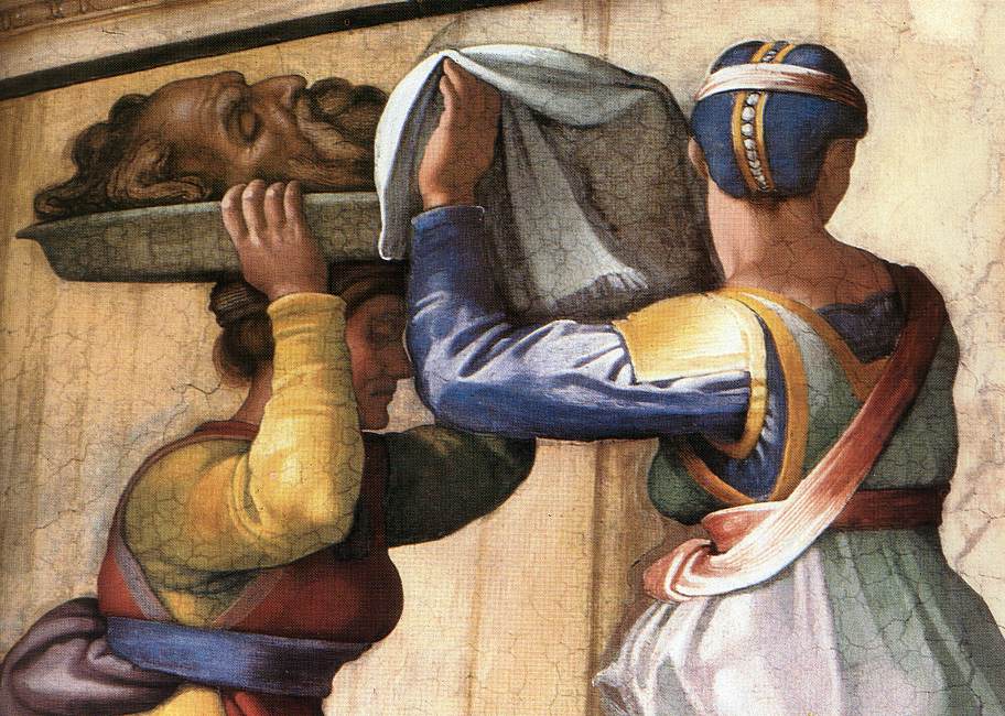
Michelangelo. Judith and Holofernes. 1508-1512
This is a piece of Michelangelo's ceiling. On the top portion, on the sides were many triangular portions for saints, and prophets. This composition is important because the subject of Judith and Holofernes is somewhat popular. and his piece is very nice. His composition for this piece is somewhat strange. Holofernes' tent seems to be made out of concrete, and the guard seems to be a tomato. Also, we see the faces of both Holofernes and Judith's maid, but we do not see the face of Judith. This is because she is looking back at the headless body of Holofernes, which could be construed as a semblance of remorse. The head of Holofernes seems to be remarkably large in comparison to both his own body, and the bodies of Judith and her maid. Which could be a symbol of the weight of their actions, and/or the difference in power of men and women in that time, to make Judith's act even braver.
The image “http://www.rense.com/general86/chapel.jpg” cannot be displayed, because it contains errors.
Michelangelo. Sistine Chapel Ceiling. 1508-1512.
This shows the majority of the work done by Michelangelo in the Sistine Chapel. in the very center is the creation of earth, humans, and sin. On the sides are various saints and disciples. At the end of the chapel is a painting of the end of days. This piece is very important because it was a huge undertaking for Michelangelo (who was also working on the tomb for the pope at the time) however it only took him 4 years, despite working alone for the most part. This is also important because for this task Michelangelo created scaffolding which could allow him to reach these heights. Michelangelo created more than 300 figures for this project.
Michelangelo. The Creation of the Sun and the Moon. Sistine Chapel. 1508-1512
This piece of Michelangelo's Sistine Ceiling is god creating the sun and the moon. He is creating them at the same time, as it is written, but not taken literally. One interesting thing to note, besides the strange but very powerful stance of Michelangelo's god, is the angel's in the background cringing and crying, and god's very stern face.
http://senseinart.27eweb.net/assets/media.Image/1/GodLightDark.jpg
Michelangelo. God dividing the Light from the Darkness. Sistine Chapel. 1508-1512
This is also from the Sistine Ceiling paintings of Michelangelo. This shows the 7 days of creation from the perspective of one of the angels watching God work. This particular piece is God separating the light from the darkness. It is interesting to note that Michelangelo's god is very humanistic, and very very masculine, but very graceful in his fluid motions to create the world. God seems to be dancing, twisting and turning to create his masterpiece, much like Michelangelo was in creating his ceiling.
http://freechristimages.org/Images_Genesis/Adam_and_Eve_in_Garden_Michelangelo.jpg
Michelangelo. Adam and Eve in the Garden with the serpent. Renaissance (1508-1512)
This piece is at the front of Michelangelo's Sistine Chapel project. This composition points out Michelangelo's tendency in the chapel paintings to show women as very masculine. Also, the question of the serpent and what it looked like is brought into play. The serpent in this image seems to be a man/woman/snake. This composition is also interesting in that it shows Adam as cognizant of the origin of the fruit before he ate it. It shows the serpent handing the fruit to Eve, while Adam points towards the heavens in a sort of pleading motion for her or the serpent to stop.
http://rjdent.files.wordpress.com/2009/09/tgoed-hb-tryptych.jpg
Hieronymous Bosch. The garden of Earthly Delights triptych. Netherlands. 1504.
This piece is a triptych which means the two small side portions close, revealing the beginning of the creation story, the creation of the earth. when you open the doors and read the story from left to right we see God in the garden of eden with Adam and Eve. The next portion is the earth in its present state, with sin and gluttony running amuck. The last portion is of the end of times, and the punishment for the way the people in the last portion were acting. This piece is important because it is a clear representation of Bosch's work. He did a few triptychs and used biblical themes and journeys of life throughout his lifetime. Also, he used many strange monsters in this work, as well as the rest of his work. The Adam and Eve portion is unique in that it shows the garden of eden in peace, but we can see a cat eating a mouse, which differs from Duer's engraving of the events. This symbol could mean many things, including that evil may have existed from creation, and was characteristic of animals (such as the cat, and the serpent) that the humans adopted. The other strange things in this painting include the weird crab thing in the middle of the composition, and the fact that strange beings are crawling from the hole in the bottom of the composition. This hole could be a lake, or perhaps a link to the world of the third painting, which would explain the evil preexisting original sin.
http://www.csa.com/discoveryguides/envrel/images/eden.jpg
Albrecht Duer. Adam and Eve. Germany. 1504.
This piece is an engraving of the story of Adam and Eve. This is before the eating of the forbidden fruit and shows the peacefulness of the garden of eden. Unlike the Bosch piece, all of the animals are at peace with one another, such as the cat and mouse which sit looking at one another. Also the ox in the background is at rest, despite its reputation of being a very angry, violent creature. We see, however, the serpent handing Eve the fruit, as if this is seconds before original sin. This piece is very interesting in that things become evident after looking at it for a few moments, such as the ox and the block at the top right which was the calling card for the artist.
http://www.bluffton.edu/~sullivanm/belgium/bruges/michelangelo/pieta.jpg
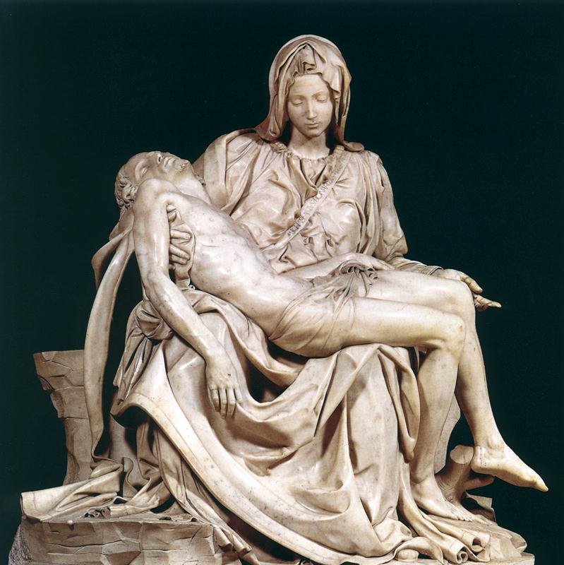
Michelangelo. Pieta. 1499.
The Pieta is a very important work by Michelangelo. It is placed in St. Peter's Basilica within the walls of the vatican city. The pyramid shape of the work is interesting to ponder, drawing the attention away from the dying Jesus and towards the face of his mother (who appears to be very young, perhaps in homage to her virginity?) Lazlo Toth destroyed part of this statue in the 1970s by coming at it with a hammer, ruining part of Mary's face (her nose is still missing) and breaking off part of her hand.
http://d1shzm2uca9f83.cloudfront.net/large/masaccio_verdrijving.jpg
Massaccio. Adam and Eve Expelled from Paradise. Early Renaissance (1424-1425)
This piece is interesting because it was done in fresco, and we can see the different patches of the artists work. Also, the fact that Eve strives to cover herself in her shame while Adam just covers his face is an interesting question to ponder. Did the artist mean to say that the female race is more shameful of their bodies, while the men are more ashamed of their actions?
The Fall of Adam and Eve, Hugo van der Goes 1470 royalty free images
Hugo van der Goes. The fall of Adam and Eve. Netherlands. Renaissance (1470)
This piece is interesting because it explores the question of what the serpent really looked like (such as in Michelangelo's portrayl.) It is interesting to notice the background images of eden seem to already be decaying. Also the convenient placement of Adam's hand and the orchid, can not be over looked.
http://media-2.web.britannica.com/eb-media/91/3991-050-975C7807.jpg
Bishop Bernward. Adam and Eve cast out. Germany. 1000ce.
This is a door on a cathedral in Germany. This work, like the bayeux tapestry is a series of images made to tell a story. This portion of the story is telling the story of Adam and Eve passing the blame of eating the forbidden fruit. God points at Adam, who points at Eve, who points at the serpent. This is important because it is unusual to see this part of the story portrayed.
http://healigan08-09.wikispaces.com/file/view/Bayeux%2520tapestry%2520-%2520Harold.jpg/41835855/Bayeux%2520tapestry%2520-%2520Harold.jpg
Bayeux Tapestry, England VS. France. 1070ce
This "tapestry" chronicles the events preceding and including the Battle of Hastings. This is important because it shows a beginning to comic books and things of that type. It is disputed over whether it belongs to France or to England, as both were featured in the tapestry on either side of the conflict.
[Christ.jpg]
Christ as conquering Roman Hero, Ravenna Italy, Byzantine mosaic
This portrayl of Jesus is very typical in stamping on the snake, as well as halo, and cross. It is, however an unusual portrayl of Jesus in that he is in a Roman uniform, and is in a quite powerful stance. The fact that is a Byzantine piece is evident in the mosaic form, as well as that it has Jesus as the subject holding the book and with the halo surrounding his head. However most other Jesus mosaics show him in a peaceful stance.